
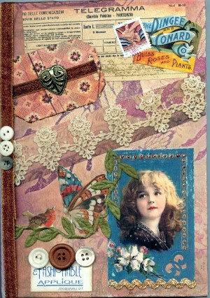
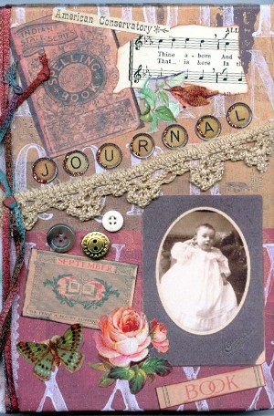
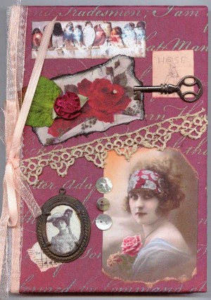
 Finished a collage I worked on the past few days. I just can't quit when I'm ahead. Well, it's all stuck down now and if it wasn't, I'd probably remove the book...I don't think it needs it now that I look at the thing with a jaundiced eye.
It's about 12 x 20 in an old frame. There are some flowers from a napkin thanks to Norah's tutorial here:http://allnorahsart.blogspot.com/2008/06/napkin-play.html. The bottom area has some anaglypta. I never knew that embossed wallpaper was called that until my friend, Sally Paul, clued me in about it and sent me a piece. I asked her for some advice along the way and unfortunately, I don't think I followed it very well. She's been an art teacher for many years (I think she said 40!!) and I would probably be considered one of her most difficult students. Go ahead, give me an F, Sally....I deserve it! That's it for today. Just going to sit back now and pick it apart in my mind and wonder about all the things I did wrong and if I had it to do over again, what would I do differently? I would love some feedback....and like I told Sally, be truthful because I'm tough and I can take it.....LOL
PS: You can click on it to enlarge. Better to see all my mistakes...: )
PS again! Revised picture added above. I tore off the top piece of heavy lace and replaced it with some player piano paper...trust me, it's better in person! Well, at least I think so.

6 comments :
Wow, that's a real mouthful! I never have heard it called that either!
I disagree about the book. One of my brothers is an Art teacher and he always says your eye should be drawn around the canvas. If the book wasn't there, it wouldn't flow as nicely.
Beautiful work as always, you know I'm a fan.
Mary
Hi Pat, I love your Collage, I think it is perfect and really love the little book, I think it adds charm, everything seems to tie in together so well...
I hope the more you look at it the more you wil see it is perfect....
Beautiful!
Brenda
Yes, I agree its an F alright!
But of course you know F is for FANTASTIC. I think you did a wonderful job on this piece, love all the texture and different elements.
Mistakes? I think it is just beautiful. We are our own worst critics!
ARGH! Blogger just ate my comments! ANYwho...I was here and love your header, collage and specially them rosey things down further that I did not get to see because Blogger is acting ugly...I think it is time for time out or a reboot! I'll visit again! Gina
either i'm just nuts or this piece is as beautiful as we are all telling you it is. put it away, don't touch it for at least two weeks. then get it back out and look at it again. believe me, it is balanced, everything flows wonderfully and the canvas is pretty wide so you need two rather large items (the book and the bird) to help it flow. as mary said, your eye needs to move about and still have resting areas (whitespace) which you have achieved without doubt. and i know, i am also my worst critic too!
Post a Comment